Flagship Project · Deutsche Telekom · T-Systems
Designing a clinical trial platform for high-stakes environments
In clinical trials, confusion isn't a usability issue. It's a safety risk.
Nine years connected to one product. Sole UX designer on a greenfield build, then returning as Manager Product Design as the team hit 60+ people. This is how that went.
designed end-to-end
error rate
product, across two stints
the scaled platform
At a glance
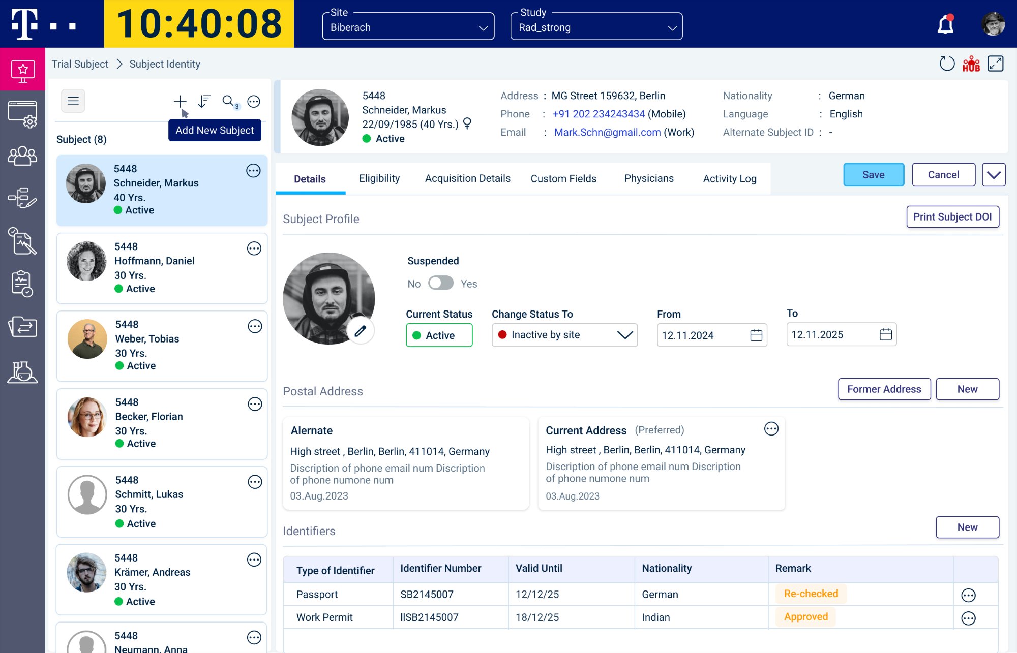
Phase 1 trials ran on a legacy Windows application that put every field on one screen, and coordinators kept paper logs because they could not trust it.
Sole UX designer on the greenfield build from 2017, then Manager Product Design on my return in 2025 with the team at 60 contributors.
- Built the IA around coordinators, not investigators, after field research showed who actually uses the system daily.
- Chose progressive disclosure over legacy density, and settled the argument with comparative task testing rather than design theory.
- Ran the execution module as a participant panel beside a procedure timeline, which is what made the paper logs redundant.
70% reduction in user error rate. On the second stint, UX moved 15 to 20 days ahead of sprint planning.
Context & Challenge
A legacy system reaching its limits.
Phase 1 trials run on tightly controlled workflows with real regulatory consequences. The client ran all of it on a legacy Windows application built for an era when putting everything on one screen counted as thorough. The brief was to replace it without losing the depth users relied on.
That last part was the hard bit. These teams had spent years with every data point, control, and status visible at once. Their instinct was "if I can't see it, I might miss it." Getting them to trust a hierarchical interface took comparative testing showing the focused approach reduced errors. That evidence carried the whole programme.
Why this product matters
Patient safety
An error here is not a bug for the next release. It can compromise a participant or invalidate months of work.
Narrow timing windows
Miss the window on some procedures and the data point is invalid. The system had to make the right action easy and the wrong one hard.
Four roles, one dataset
Investigators, coordinators, monitors, and admins work the same trial data with different access and different definitions of done.
Regulatory compliance
Every action leaves an audit trail, without turning daily clinical work into a compliance exercise.
Scope of Ownership
Project Journey
One product. Four roles.
I joined TrialComplete in Q3 2017 and grew through three roles over four years, then returned in October 2025 as Manager Product Design. Same product, very different brief.
UX/UI Designer
Field research, IA foundations, first module designs
Senior UX Designer
Core module delivery, iterative testing, 70% error reduction
Lead UX Designer
Platform-wide UX ownership, design system, cross-team alignment
Other roles
Manager Product Design
Team of 3, process reform, upstream UX, design system governance
No existing product. No shared understanding of the domain.
TrialComplete was built from nothing, and the team held untested ideas about where the real pain lived. Without research we would have shipped whatever the loudest person in the room believed.
I went on site in Germany to watch the work rather than read about it. Interviews, workflow mapping by role, and SME workshops gave the team a shared picture of how a trial actually runs. Everything else was built on that.
Coordinators, not investigators, were in this system every day. That single finding reshuffled the IA. We had been designing for the wrong primary persona, and catching it early saved months of downstream rework.
The legacy app had trained users to expect everything at once. They were not asking for bad design, they had built habits around it. Changing that needed evidence, which is what the comparative testing in Phase 02 produced.
Ethnographic observation · Contextual interviews · Workflow mapping by role · On site workshops in Munich
Strategic Impact
Direction set from observed reality, validated on site with clinical coordinators in Germany
Design Decision
Coordinator first IA, built around the role that uses the platform daily
Stakeholder Signal
Going on site earned client trust before a single spec was written
200+ screens. Four distinct personas. One coherent system.
Four roles use this platform, with different needs and different definitions of easy to use. Designing equally for all of them would have suited nobody. As the only designer I had to prioritise, and build an architecture that could hold 200 screens together.
Six modules, each with role based permissions and a clear task focus. Leaving the legacy model was tested, not preferred. Task completion sessions showed focused views beat dense layouts for multi step clinical work, which gave us something to defend when stakeholders pushed back.
Core Design Decision
Progressive disclosure over information density
Their instinct was reasonable: if you can see everything, you cannot miss anything. Testing told a different story. Focused hierarchical views consistently outperformed dense layouts for the time pressured work coordinators actually do.
Design Rationale
Visibility is not clarity. Showing everything at once gives the illusion of control while raising decision overhead. Where one missed field has compliance consequences, that overhead is a risk, not an inconvenience.
Core modules structured
Subject Recruitment & Screening
Eligibility, consent, and enrolment tracking. The most frequent coordinator workflow, so it got the most attention.
Execution Runner
Live procedure tracking across several participants at once. The riskiest problem on the platform, and where the 70% error reduction came from.
Review & Validation
Multi level approvals with clear handoff between clinical and regulatory roles, so accountability was never ambiguous.
Admin Configuration
Role permissions and protocol management, powerful for admins without requiring clinical expertise.
Export & Reporting
Audit ready outputs. Every decision here came from regulatory requirement, not product convention.
Procedure Library
Reusable templates for protocol driven procedures. Cut setup time and configuration errors across trial types.
Architecture
6+ modules with clear role based permission models
Scale
200+ screens held together as a navigable system, as sole designer
Validation
Progressive disclosure validated in comparative task sessions with clinical users
Platform architecture: how the modules connect
Clinical workflows are not linear. Standard patterns weren't safe enough.
The execution runner is where coordinators run live procedures across several participants at once, and where getting it wrong had patient consequences. They kept paper logs because the legacy system could not be trusted. The load was causing protocol deviations, not edge cases.
What didn't work initially
The first iteration replicated the density of the legacy app inside a web interface. It felt familiar in testing but it raised the load rather than reducing it. Coordinators were still juggling too much at once. That failure forced the rethink. Users who had seen the first version immediately recognised why the hybrid worked better, which made it far easier to defend.
Coordinators tracked several procedures, participants, and timelines at once while maintaining paper records. Missed procedures triggered protocol deviations, a compliance failure with real consequences for the trial.
Switching between participants broke the thread. Coordinators lost their place in a sequence and had to backtrack, which ate into the narrow windows some procedures have.
Roles sharing the same data had no structured handoff. Nobody could tell who had reviewed what, or when the baton passed to the regulatory reviewer. That ambiguity created gaps nobody owned.
Three approaches evaluated
Table-Heavy Views
Familiar but overwhelmed multi-participant tracking
Sequential Flows
Structured but inflexible for parallel procedures
Hybrid Model
✓ Chosen: structure plus live visibility
Key Design Decision
A hybrid execution model for structure + visibility
Tables gave an overview but fell apart across parallel procedures. Sequential flows imposed an order the work did not have. The answer was a hybrid: a participant panel running alongside a procedure timeline, so coordinators saw who they were with and where each procedure stood without leaving the view. No context switching, no paper backup.
Design Rationale
Coordinators needed the participant view and the procedure status at the same time, and no conventional pattern delivered both. Keeping those layers visible in parallel is what made the paper logs redundant.
Error Reduction
70% reduction in user error rate, from moderated usability testing and validated in production
Product Launch
Phase 1 platform delivered and adopted by research organisations globally
How we got there
Three approaches tested with real users before committing to the hybrid
The product scaled to 60+ contributors. Design was still being pulled in after decisions were made.
Returning as Manager Product Design, the problem was structure, not effort. Design got called in after problems surfaced, when changing course was already expensive. I moved UX from a reactive function to a driver of product decisions.
The shift wasn't about more meetings. It was about moving UX to where decisions were still open, before they hardened into engineering commitments.
Design system: from inconsistency to coherence
The design system wasn't an aesthetic exercise. It was the only way to hold quality across 200 screens while the team and the product were both growing.
Colour System
Replaced decorative colour with a semantic hierarchy. State, action priority, and compliance status became distinct for the first time.
Typography & Density
Rebuilt the type scale for views used 8+ hours a day. Less eye strain, fewer errors from misread labels.
Interaction Patterns
Standardised tables, forms, modals, and navigation across all six modules, so the right pattern became the easiest one to reach for.
Component Architecture
PrimeNG components with a custom UX layer, so engineers could implement at scale without design becoming a bottleneck.
UX earlier in the cycle
Framing problems together instead of handing off solutions late. Engineering stopped being surprised in sprint demos.
Mentoring 3 designers
The shift I cared about most was moving people from "does this look right" to "is this the right problem". That line between execution and design thinking is learnable.
Process
UX in the room 15 to 20 days before sprint planning, with fewer late changes across cycles.
System
Design system adopted across all modules, which cut rework and sped up delivery.
Influence
UX shifted from reactive to proactive, shaping product decisions rather than responding to them.
Outcomes
What changed.
Built and scaled an enterprise platform
Designed from greenfield as the sole UX designer, to a multi module system supporting regulated workflows across recruitment, execution, and review.
70% reduction in user error rate
Measured through moderated usability testing with clinical coordinators and validated in production, on the execution runner where errors carried compliance consequences.
Enterprise adoption in a regulated domain
Adopted by research organisations running Phase 1 trials. Every workflow traceable and every decision auditable, without slowing clinical teams down.
System level consistency at scale
A design system that cut inconsistency across 200+ screens and was built to outlast any single contributor.
Key Learnings
What this product actually taught me.
Usability and compliance are not opposed, but you have to earn that argument
I assumed early on that a good interface would naturally be compliant. Regulation shapes interaction patterns in ways that are not obvious, and you have to know the rules well enough to tell where the real flexibility is. That knowledge comes from the room, not from documentation.
At 200 screens, the system matters more than any single screen
I spent too long early on polishing individual flows. One inconsistent pattern in a product this large erodes trust in all the rest, and you cannot design your way out of that after the fact. It has to be structural from the start.
Process changes outlast any individual design decision
Earlier UX involvement, critique rituals, a different way of framing design problems: those changes affected everything that came after. A single good wireframe has a lifespan. A better process does not.
The best thing you can do for a team is make them not need you
Moving into management, my instinct was still to solve problems directly. What actually worked was helping the team build their own judgment. Designers who think independently produce better work and hold up better when priorities shift.
What I'd do differently
Nine years on one product taught me something hard to learn any other way: what it takes to keep a design coherent while the team scales and the brief shifts under you. The work changed. The standards didn't.
Designing for clinical trials taught me that clarity isn't only a usability goal. It's a responsibility.
Related Work
Three smaller stories from the same product.
The main study covers nine years and the whole platform. These three go narrow. A workflow clinical staff had stopped trusting, what it takes to get three designers building from one spec across 200 screens, and the AI tooling I built for the delivery team.
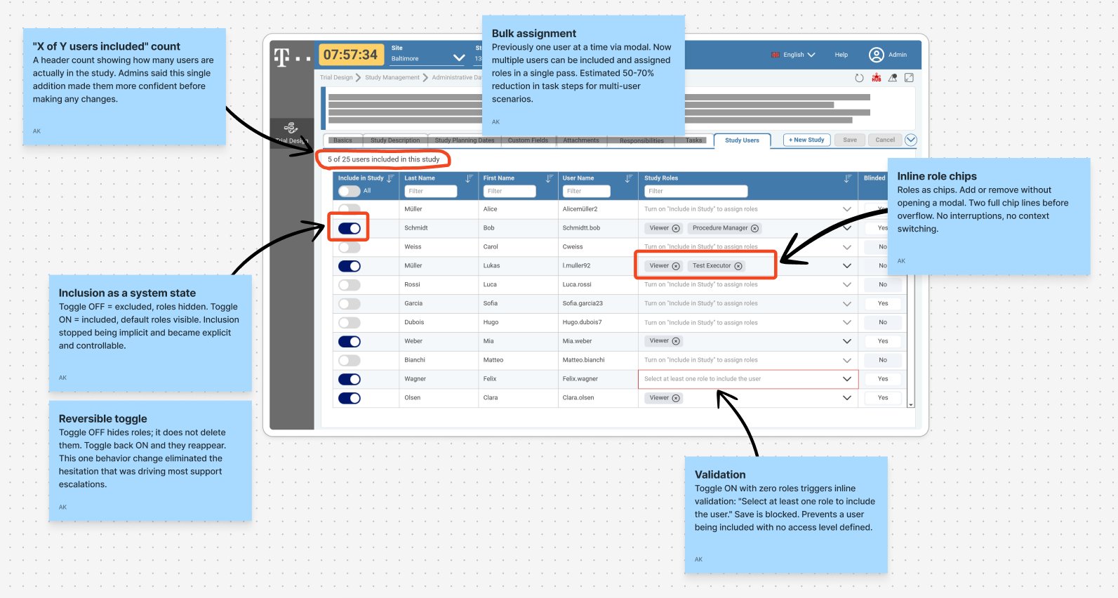
When admins toggle a user off, should their roles disappear? The system said yes. Admins assumed no. Closing that gap took a toggle driven inclusion model, inline role chips, and a service blueprint that aligned engineering before any UI was touched.
Read the case study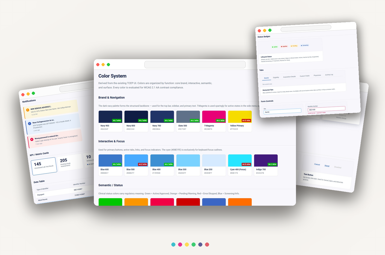
No shared system, four multi select variants, five button styles for the same action. This is the incremental approach that brought structure to a product that had outgrown its design practices, without pausing a sprint.
Read the case studyAn AI pipeline for a team working under GxP. It moves a feature from raw brief to stories and test cases, and no generated text enters the record until a human has accepted it. Validated with the delivery team as the reference for the production build.
Read the case study