Sub-Study · TrialComplete · T-Systems ICT India · Manager Phase
Fixing design debt
without slowing delivery
No shared system. Four variants of the same component. Teams working in silos. This is the incremental approach that brought structure to a product that had scaled faster than its design practices.
consolidated to one
the shared system
from one spec
to get it done
At a glance
The product had outgrown its design practices. Four variants of the same component, no source of truth, and a Product Owner asking to stop development for a year to fix quality.
Owned the system as Manager Product Design, building it alongside active delivery rather than as a separate project.
- Built incrementally instead of big bang, because stopping delivery was never a real option.
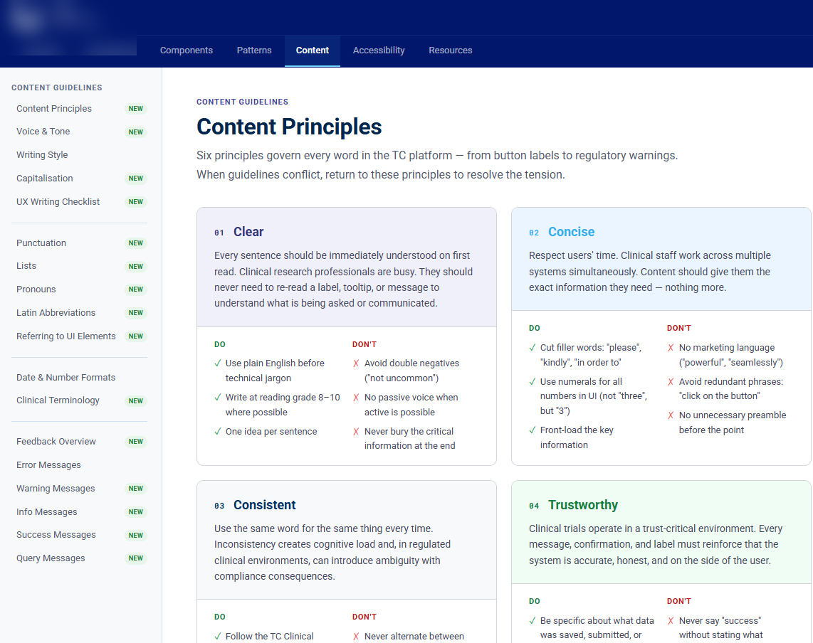
- Aligned patterns to the actual stack of PrimeNG, AG Grid, and Forms.io, so the system could ship rather than sit in Figma.
- Shipped decision guidance, not just component specs, so teams could answer new questions without escalating.
One shared system across 200+ screens and 3 designers, with zero pause in delivery.
Context
The product had scaled.
The design practices hadn't.
When I rejoined the team as Manager Product Design, the product had grown a lot: more modules, more developers, more designers. But there was no functional design system. Just scattered documents, inconsistent implementations, and no shared way of working.
That was a Product Owner. Not realistic, but it tells you how bad things had got. The gaps were not only visual. They were systemic.
The Problem
Six ways the system
was already broken.
No single reference for UI or patterns
Designers and developers decided independently. Nothing answered "what does this component look like" or "how does this interaction work".
Four or more variants of the same component
Multi selects, dropdowns, tables: every module had its own version, none consistent, all maintained separately. Users moved between modules that felt like different products.
No guidance on how to make design choices
Facing a new UI problem, teams had no process for deciding. Choices were ad hoc, undocumented, and rarely reused.
Error messages, labels, formatting all over the place
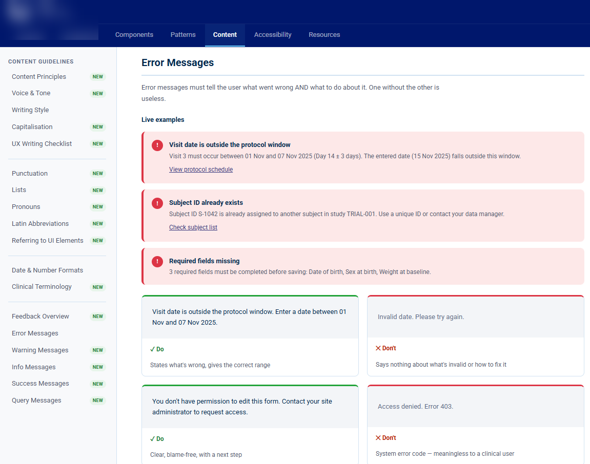
The same error could be worded five ways, date formats varied, and field labels for identical data changed by module.
PrimeNG, AG Grid, and Forms.io, used without alignment
Different modules used different libraries for the same patterns. Design ignored implementation constraints, which meant constant negotiation and rework.
No review culture, no shared ownership
Design was not reviewed consistently, so nothing caught inconsistency before it shipped. Problems compounded quietly, sprint by sprint.
- Slower cycles, because the same problems were solved again from scratch
- Teams in silos, with no visibility into what others were building
- Repeated change requests after handoff, because expectations were never shared
Before vs After
What fragmentation
actually looks like.
My Role
Ownership alongside
ongoing delivery.
This wasn't a separate project with dedicated time. It had to evolve in parallel with active development. I took ownership of driving structure without stopping the business.
No pause in delivery. The system had to be built around the product work, not instead of it.
Approach
Incremental,
not big-bang.
Process
How it actually
got built.
Three phases, no big reveal. The system shipped continuously.
Audit: see what is there
Reviewed all existing UI, patterns, and documentation, then mapped the duplicates and gaps. You cannot fix what you have not seen.
System definition: agree the rules
Defined component structure, usage logic, and naming conventions. Established a decision framework so teams could answer "how do we handle this?" without escalating every choice. Hosted and maintained locally, evolving with every sprint.
Alignment: get it into the team's hands
Worked with Product and Engineering to adopt the system in active development. Components entered the codebase as they were standardised, and governance stayed light: review rituals, not bureaucracy.
Impact
What shifted.
Consistency
Modules that felt like different products now share one visual and interaction language.
Clarity
Teams stopped "figuring things out individually." Shared reference, shared decisions.
Rework
Fewer change requests after handoff. Patterns were agreed upfront, not discovered in review.
Onboarding
New designers and developers have somewhere to start. The system is a reference, not tribal knowledge.
Alignment
Design decisions account for tech constraints from the start, so there is less negotiation late in a sprint.
Delivery
All of this happened without pausing feature work. Incremental improvement, continuous delivery.
Reflection
Design debt doesn't
break things overnight.
It builds quietly, sprint by sprint, until users feel it and developers dread touching it.
- Fixing it is not about more components. It is about clarity and ownership
- A design system that lives in Figma but is not adopted by engineering is documentation, not a system
- The goal is a reference teams can trust, not one more artefact they have to maintain
Design debt is systemic, and visual audits alone do not fix it
Align with the tech stack first, or the system won't ship
Decision guidance matters more than component specs
Incremental beats big bang, because a system that grows with the product lasts longer
The Product Owner's quote was about quality. The real answer was not stopping development. It was the structure that makes quality sustainable at pace.